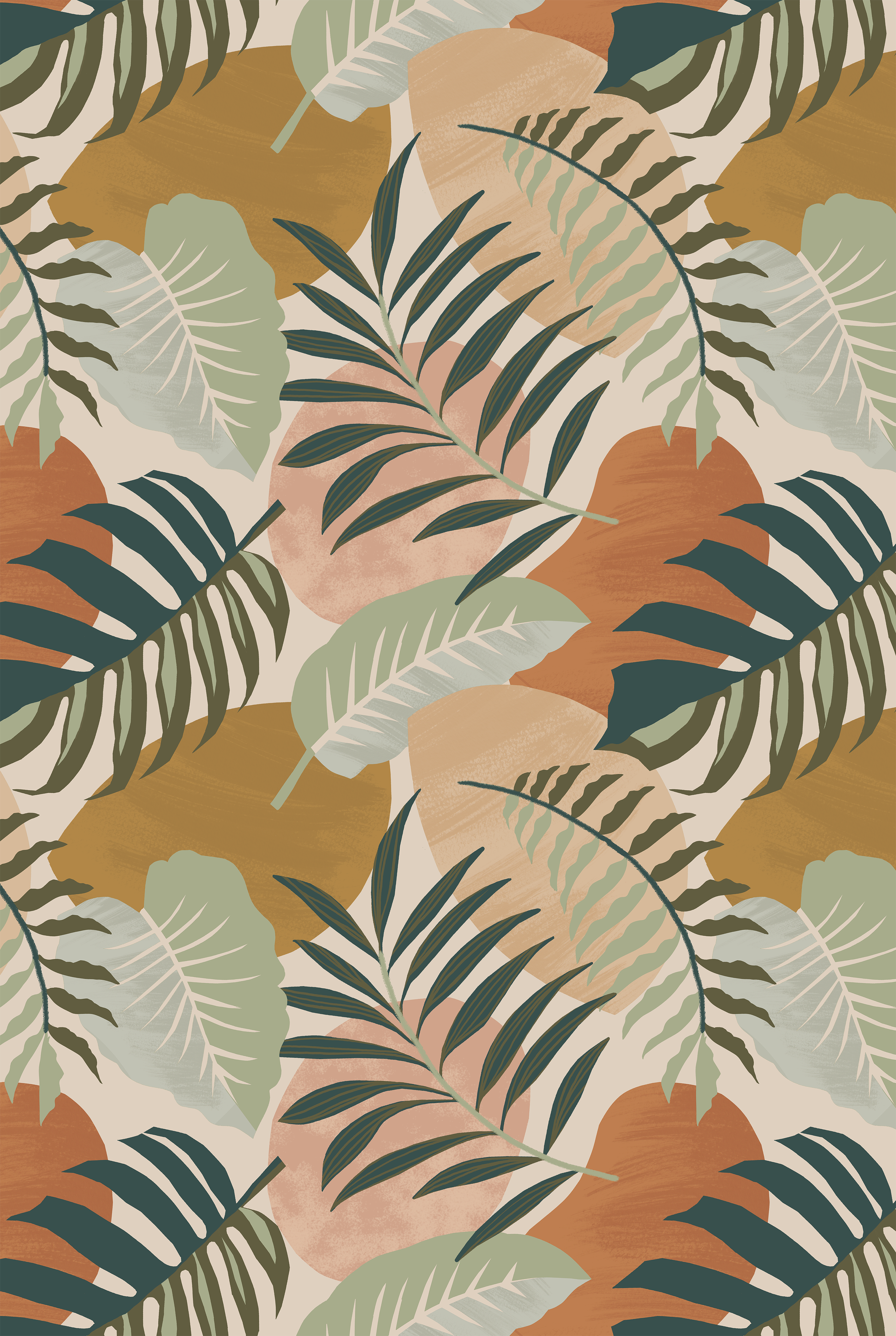
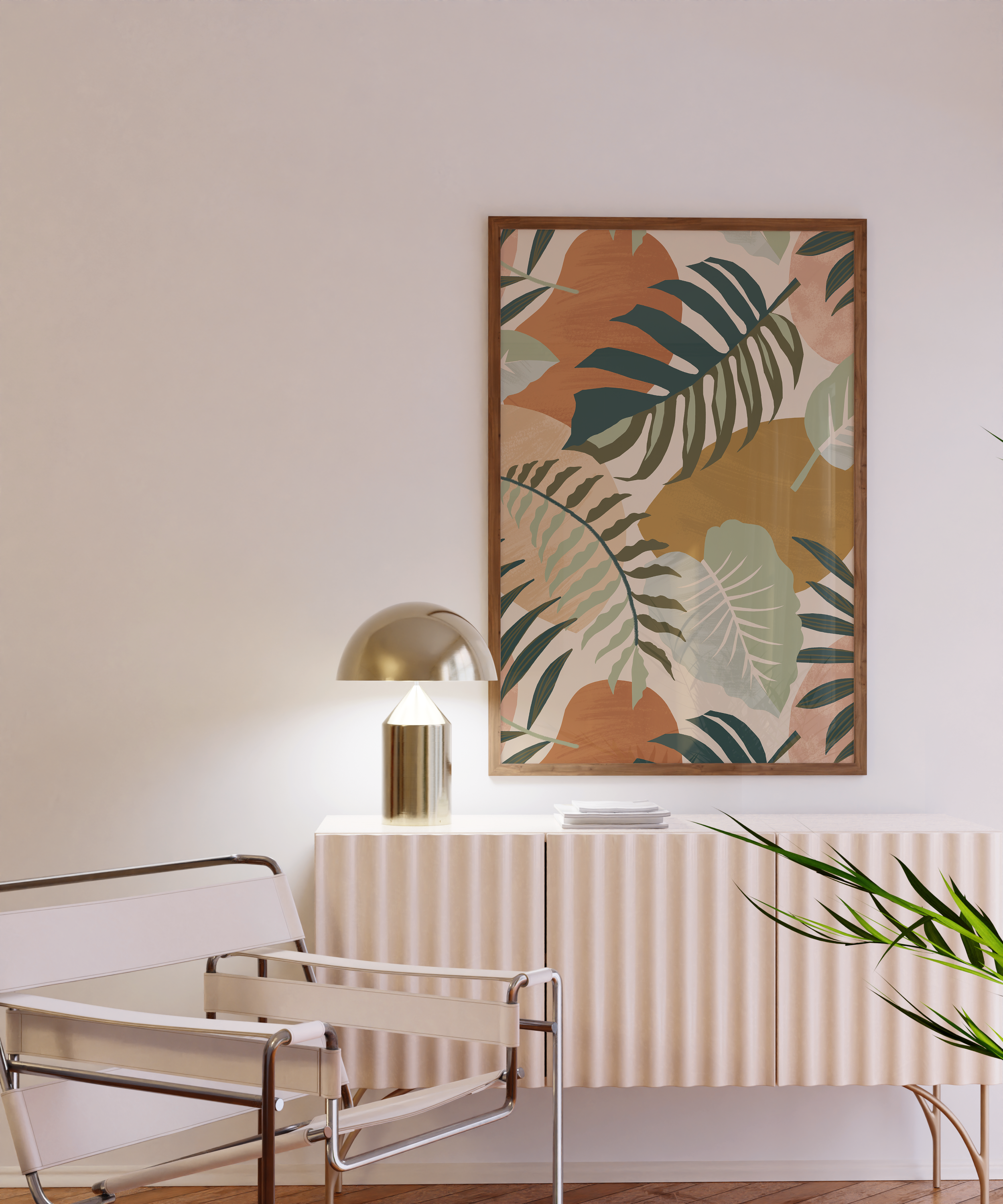
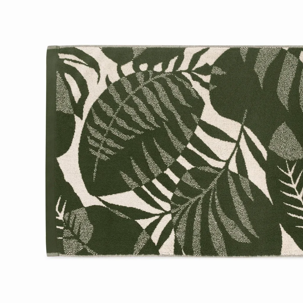
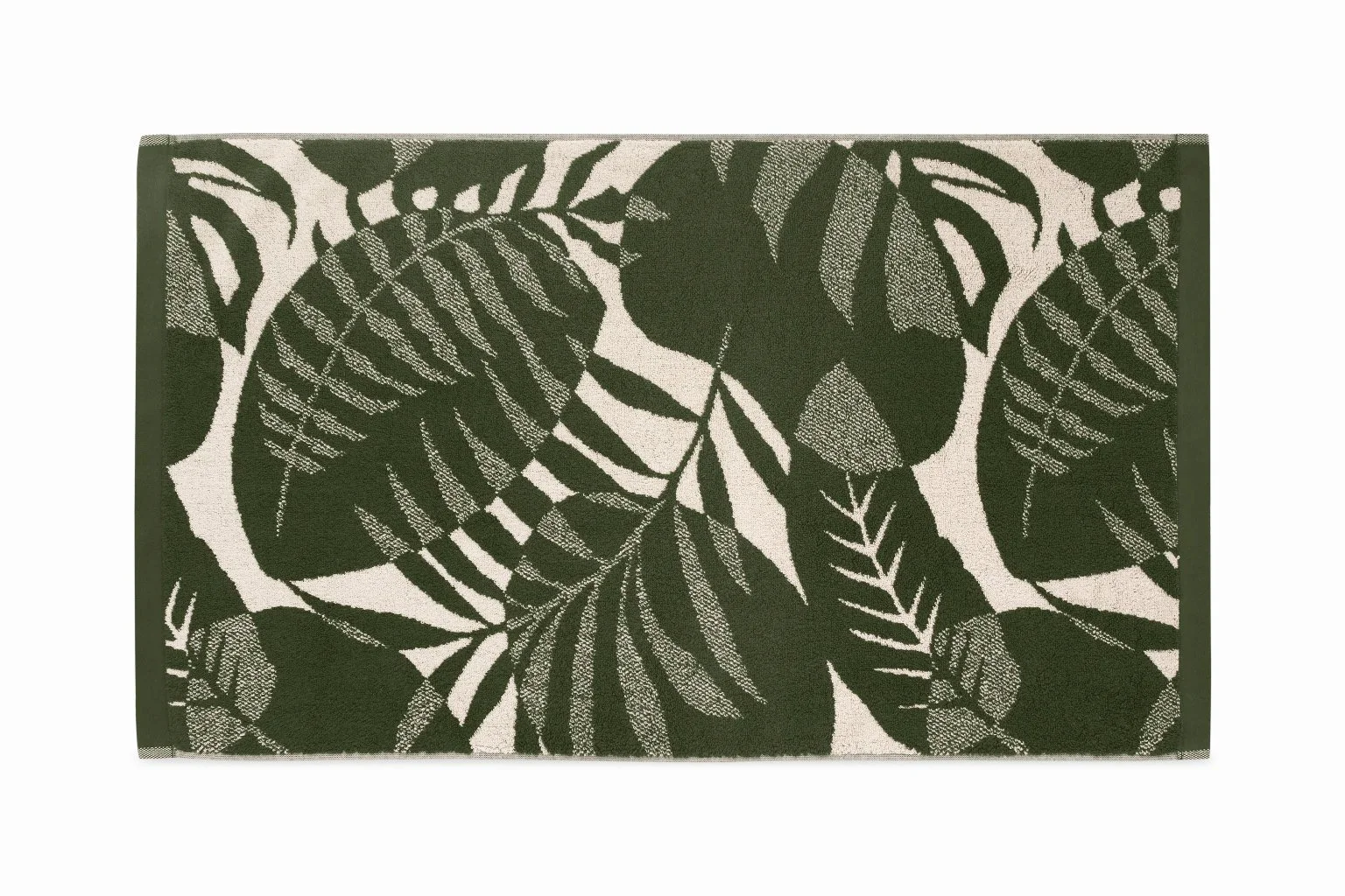
Made.com had botanicals. The brief was to find a different angle on a category the brand already owned.
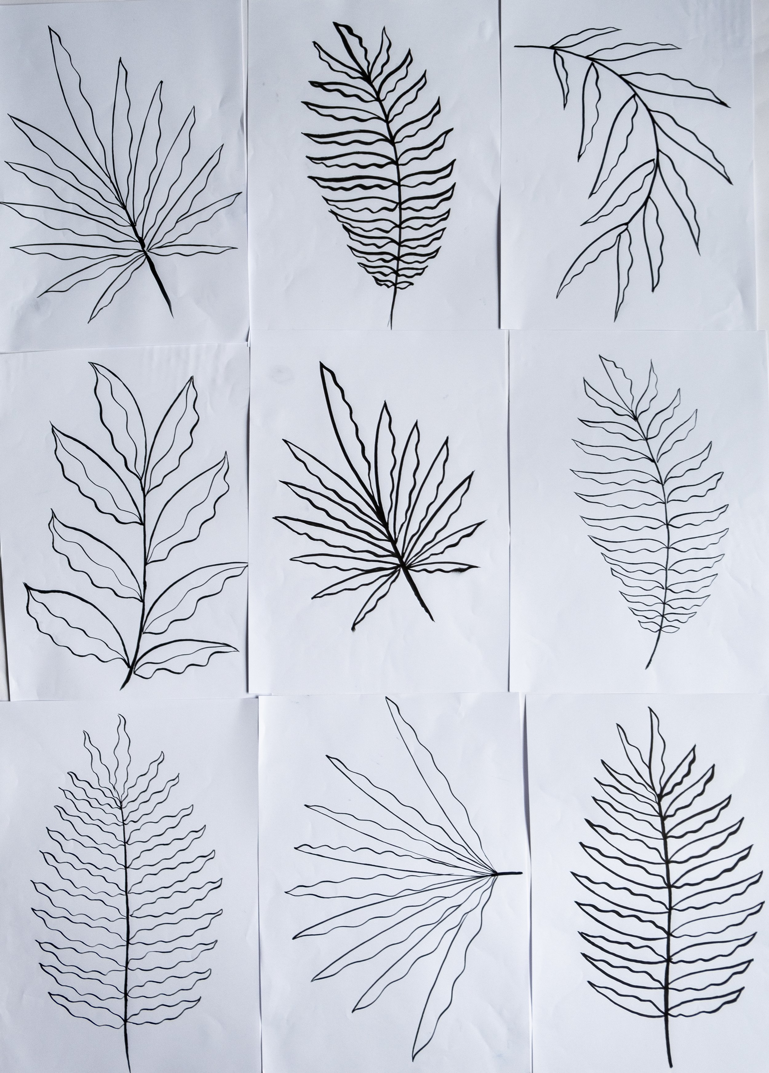
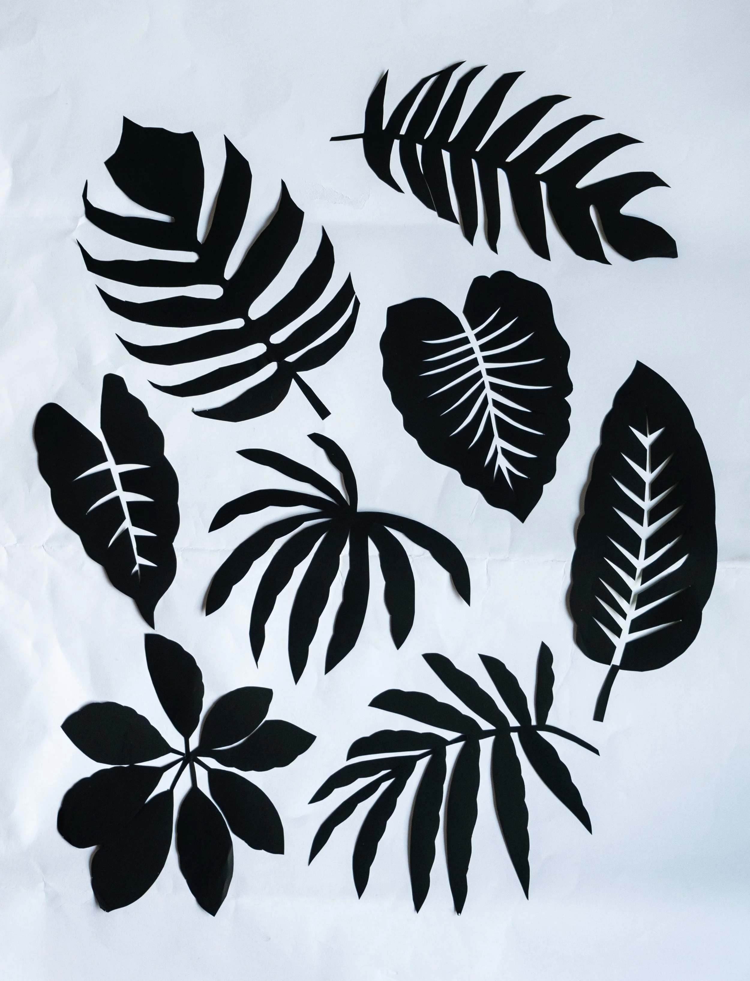
I went with collage. Palm leaves cut clean and flat, layered over abstract shapes sitting behind them. The abstract layer is what separates it from a straight botanical — it moves the eye through the repeat without adding colour complexity. Where most palm prints just tile the same motif, this one builds rhythm from the way the forms cut across each other.
The palette stayed green throughout. Three or four colours total, with the abstract shapes working as tonal shifts rather than a separate story. Nothing competing with the leaf.
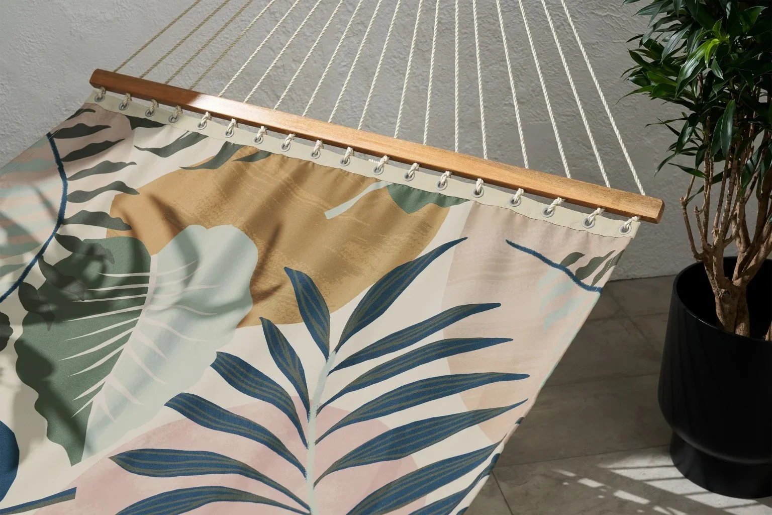
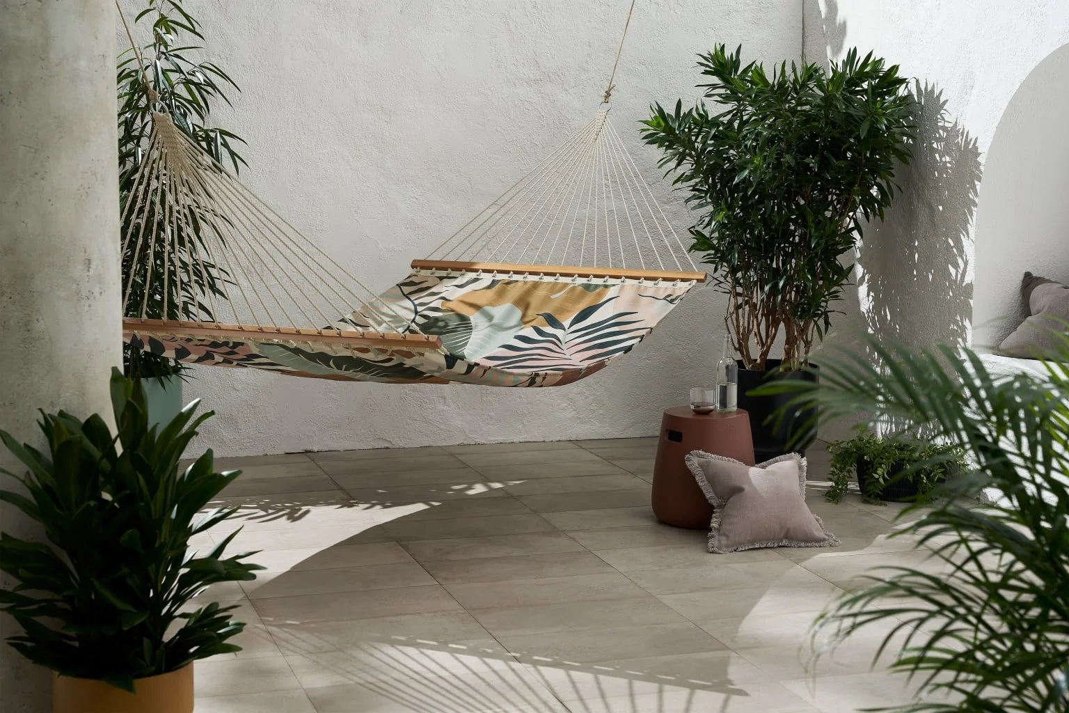
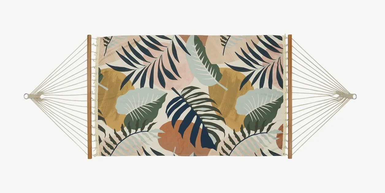
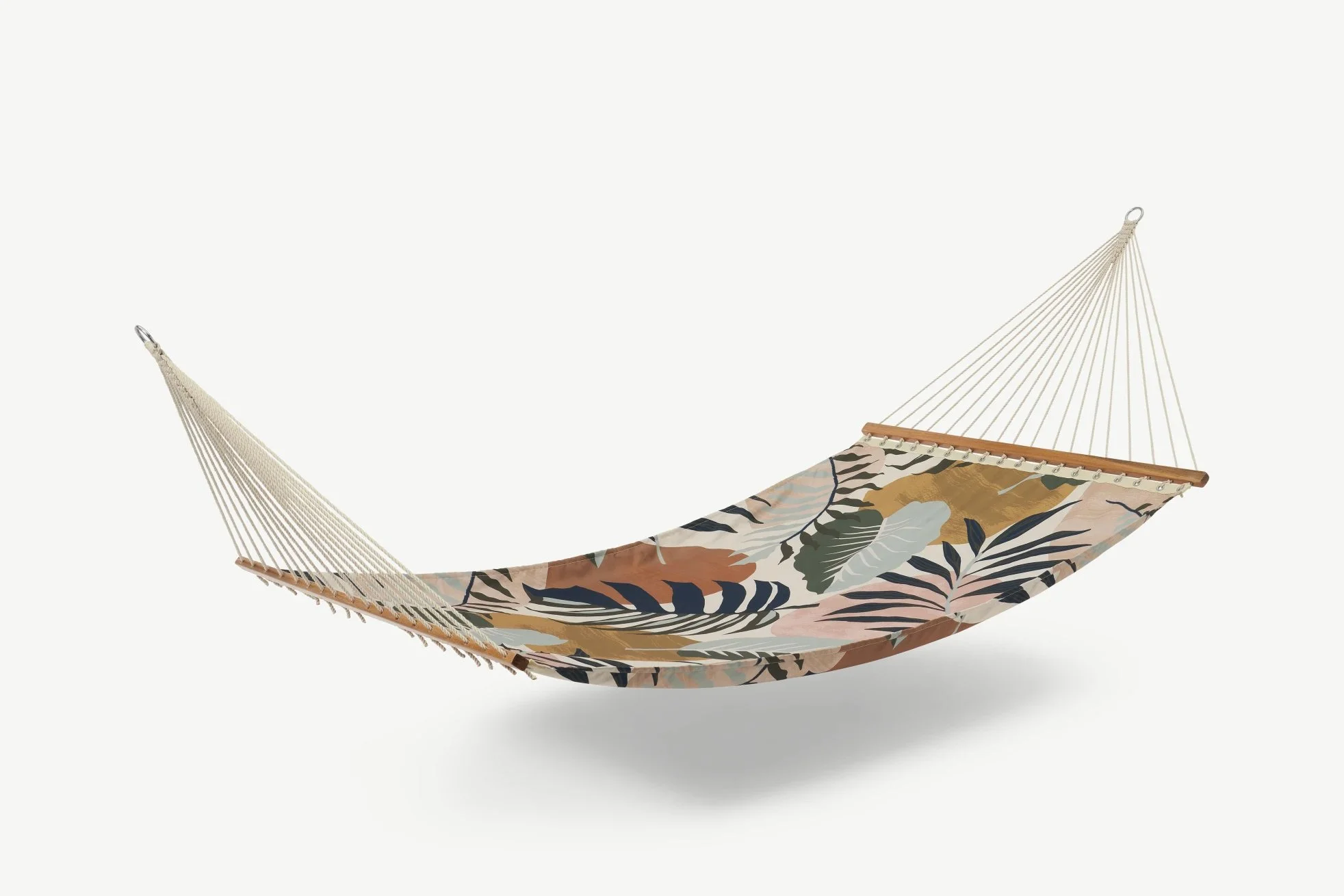
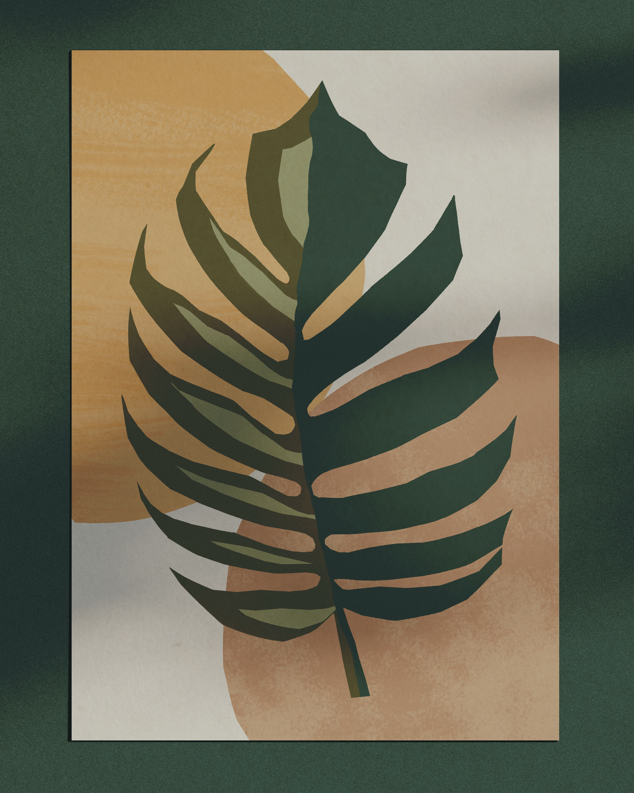
The placement version took the strongest single motif out of the repeat and gave it room. Same approach, different scale.