Inky Tropical Blues
Personal project | surface pattern | repeat design | homeware application
Done in my own time, between other projects, to keep my hand-drawing skills sharp and show what I can do across the full process — from original artwork through to a finished repeat.
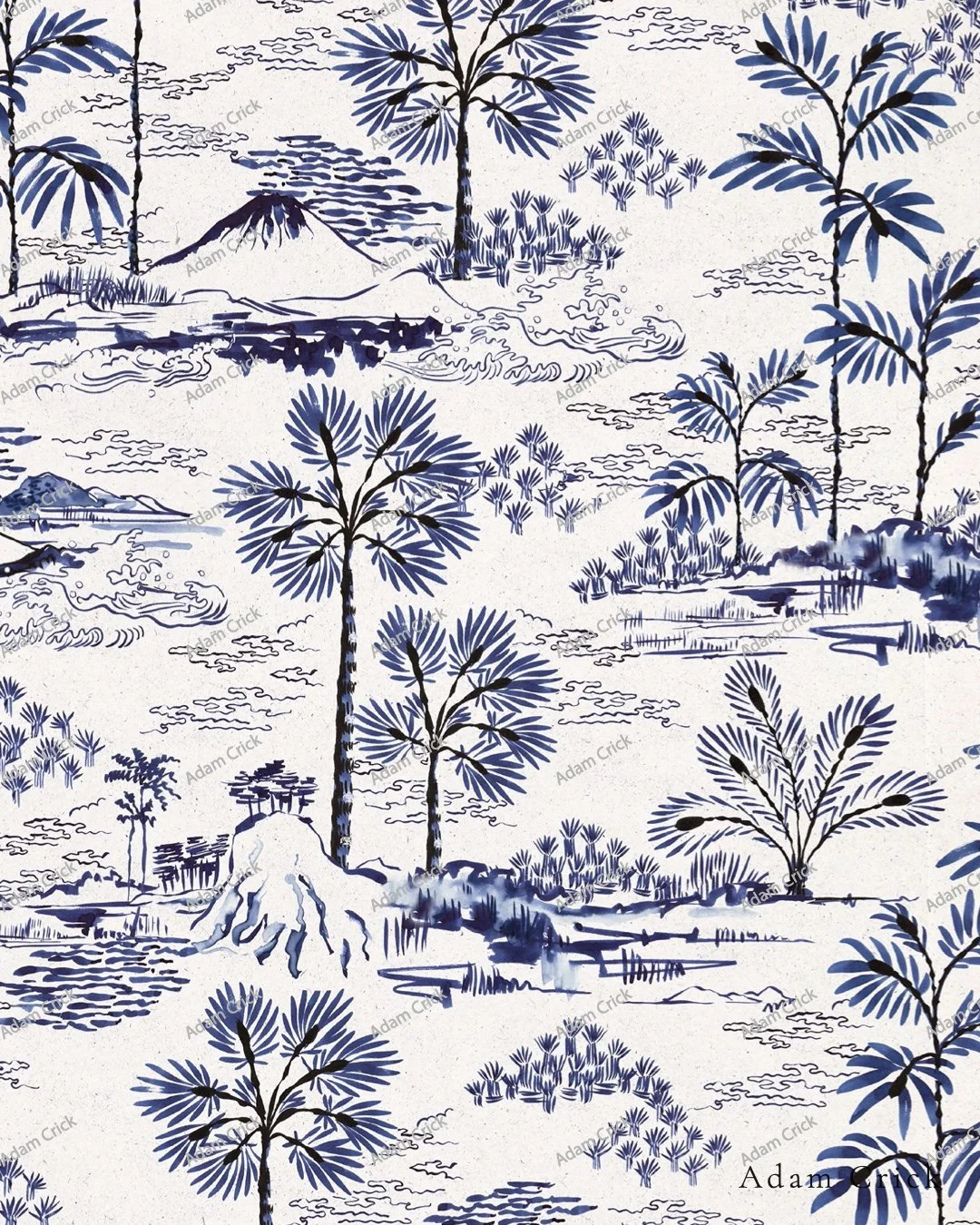
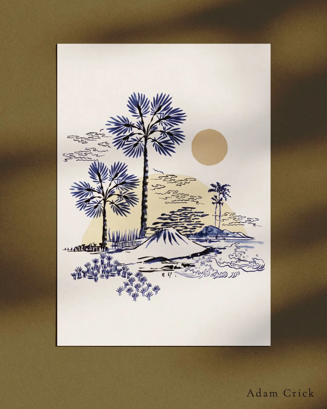
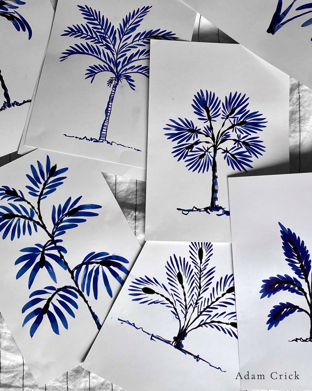
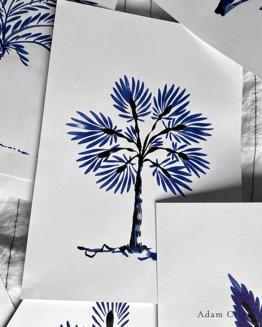
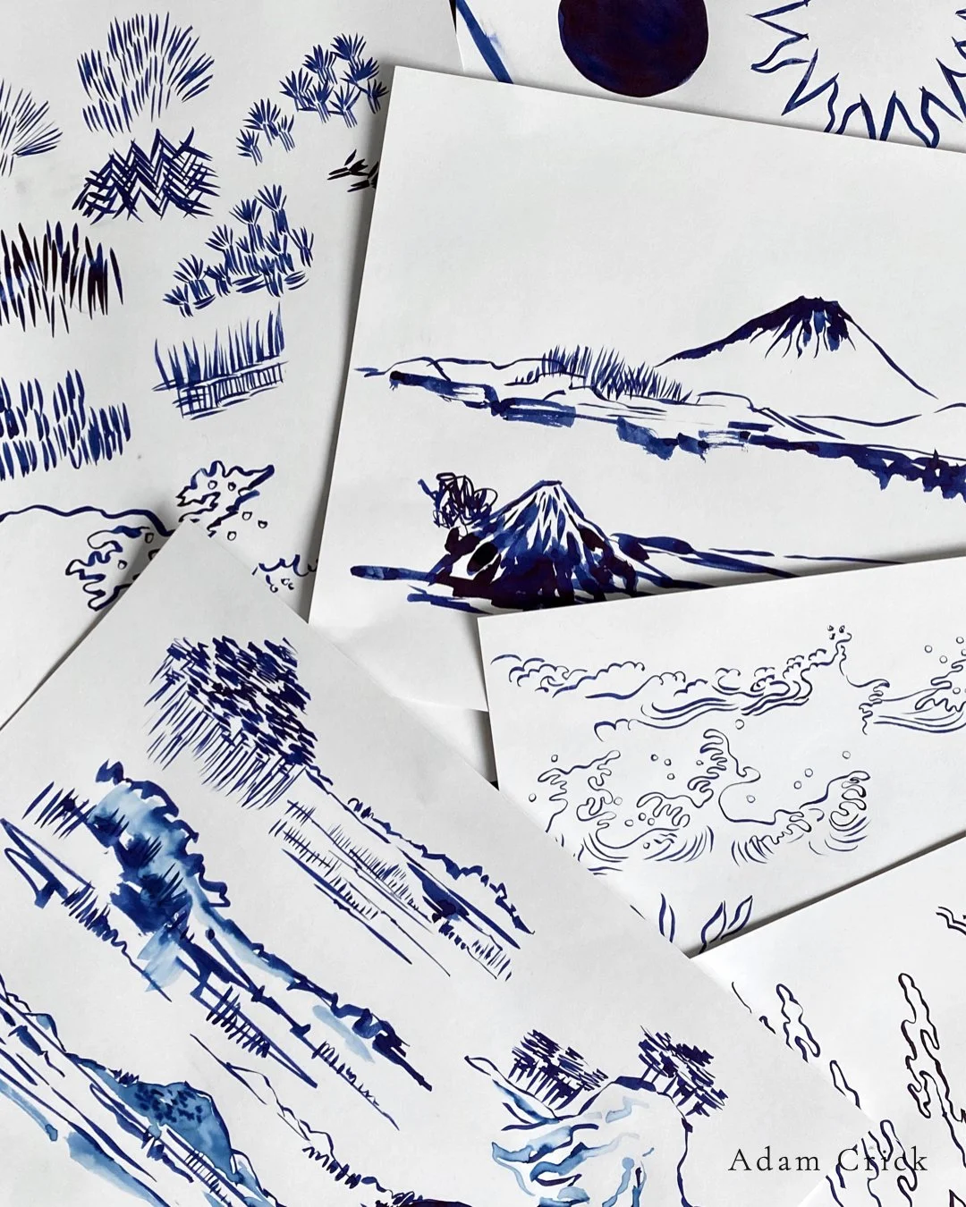
I painted a series of tropical trees and landscapes using sumi ink and Japanese brushes. Palms, fan fronds, mountains, wave forms. The looseness of the medium was part of the point — I wanted that brushwork to stay in the final pattern rather than get smoothed out in the digital stage.
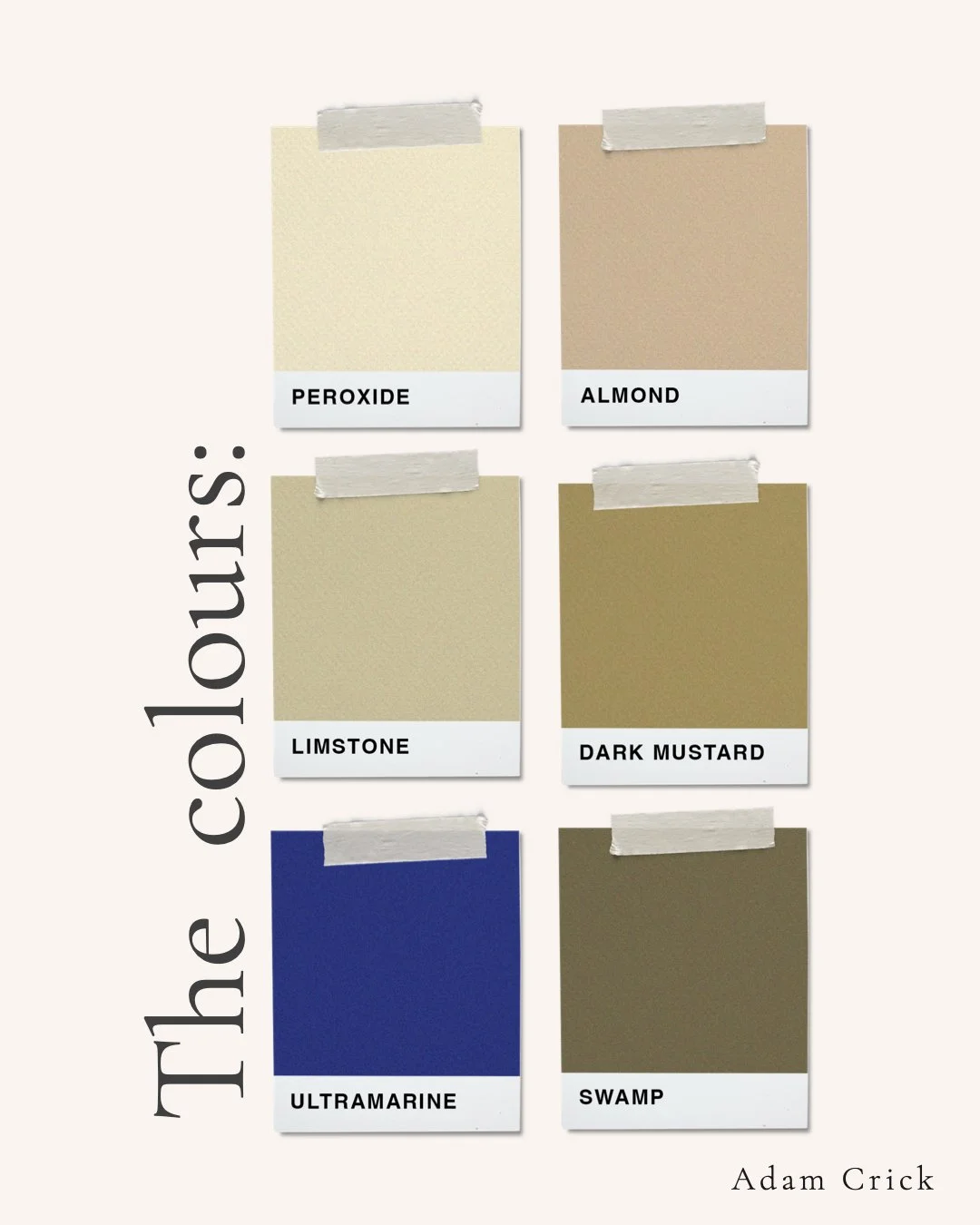
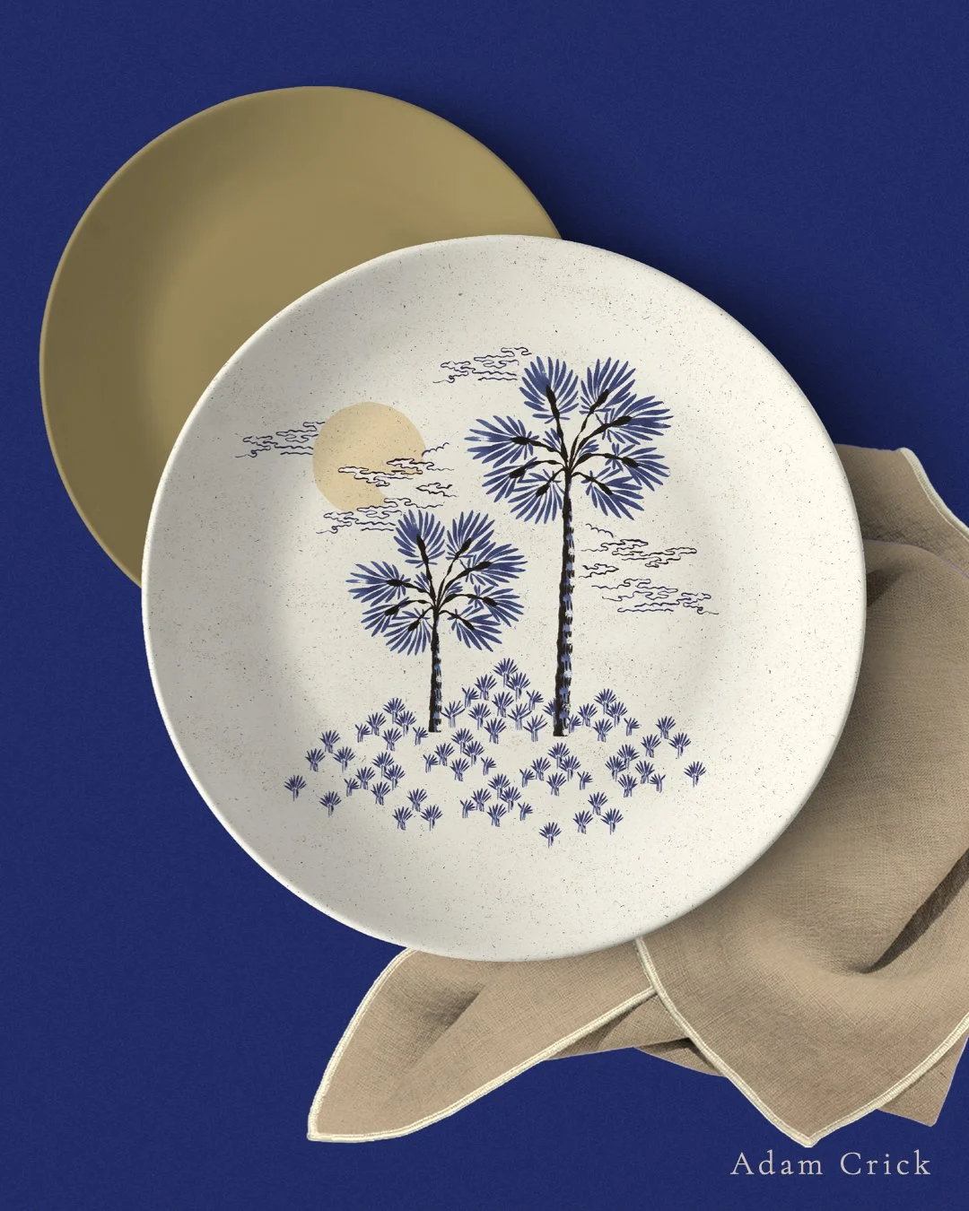
The colour was a separate decision. The easy route with a toile-influenced print is navy and white. I researched colour trends at the time and built a different palette instead — ultramarine alongside blonde, limstone, and muddy mustard tones. The idea was contrast: something traditional in its mark-making, current in its colour.
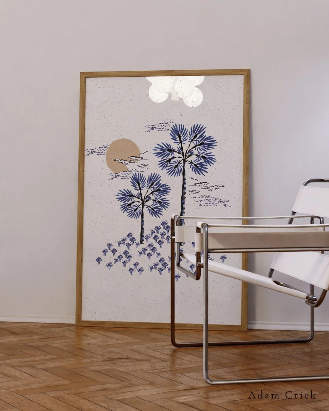
Once scanned, the paintings were digitally arranged into pattern groupings and a full seamless repeat. Individual motifs were also extracted to use separately, so elements could work across different surfaces without needing the whole repeat behind them. That flexibility was something I thought about from the beginning, with the homeware market in mind.
The mockups — wallpaper, ceramics, wall art — were speculative, but gave me a way to show how the print family could stretch across a real product range.